Hello, there!
Alert: If you don't like pink, I recommend you scroll no further! ;)
Going strong right now with my Documented Life journal. How about you? My mojo waxes and wanes, so I don't feel like showing the blah-pages, just the good ones. Believe me, not happy with lots of my weeks, but I will not re-do them! This project is a wonderful process in getting more practice with techniques and learning new ones! I'm really having a hard time with the Face challenge. That one sits, unfinished at this point!
My previous post (and week) was all about gorgeous Fall, with Fall colours, but for this week, I ran with my favorite colours: pink, turquoise, and yellow. I think I like Fall because of the brightness of the colours.
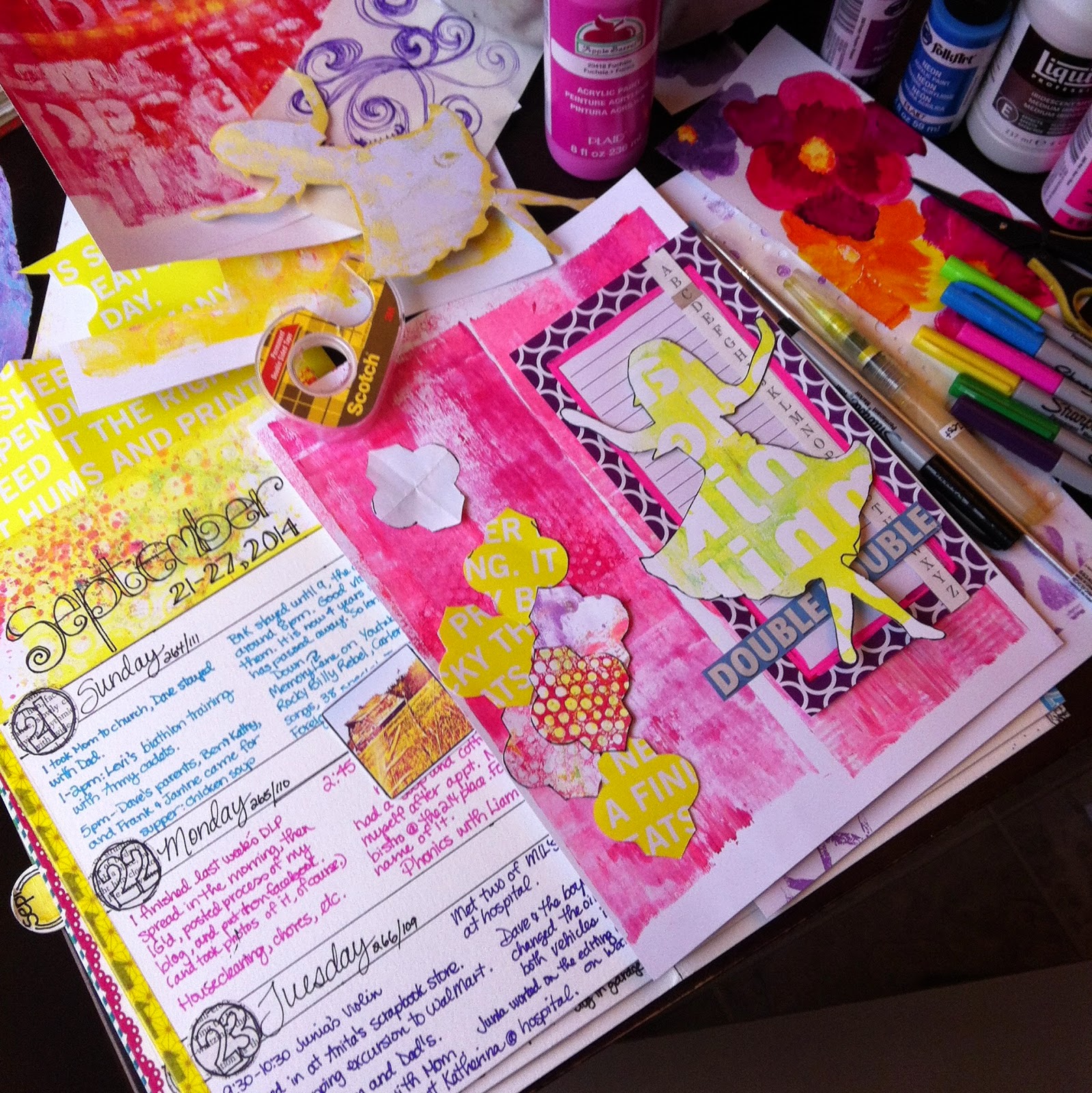
Photo above is my Week 39 spread, with tip-in closed.
I completed the Week 12 Challenge: Cut up a magazine and add it to your page. (Working completely out of order with this project!)
Back to the yellow Moroccan tile shapes: I was in the stationery section of a grocery store, looking for something, when I spied some fabulous bright yellow paper, with white text. Upon closer inspection, it was the covering for copy paper. Well, all of a sudden copy paper was on my to-buy list! Teehee! So, that's what that paper was converted to!
I added depth by using a watercolour pencil, Sharpie marker and waterbrushes loaded with yellow, pink, and brown ink. Learned that trick from the fabulous Roben-Marie Smith, one of the talented Art to the 5th girls. The challenge said to use a magazine, but I figured packaging counted too. ;)
The other morrocan tile shapes are Gelli-printed paper, which, by the way, I have an gi-normous pile of!
Seriously, my Gelli-print pile is at least a foot high! A great way of using up these fun prints is making party banners, which I have done quite a bit of. That project could be the fodder for a future blog post perhaps?
Added some fun junk mail snippings, old children's book pieces, a page from a note-pad that I altered with neon-pink paint marker, and words that represent my longing for my niece that hasn't been with us for some time now. I miss her so! I painted in those words behind the girl shape.
I created the girl by taking a photo of my artwork that I had made in remembrance of her a few years ago. She is dancing freely in heaven. She can dance like she wants to now. I have a very sweet set of photos of her dancing on our lawn with my daughter and her younger sister. So precious. She is happy happy now, dancing for her saviour Jesus!
Why I chose to include my niece in this week makes no sense, because it was this week four years ago, that we lost a nephew on my hubby's side of the family. One day I will document that.
The pink background is simply made from cleaning off the brayer during Gelli-printing. I added scratchy lines with my fine-line Sharpie marker.
Tip-in open. The week header and the background of the tip-in areGelli-prints, altered with watercolours, stencil shapes, white gel pen, and more. The beautiful flowers are painted by my daughter. Those shapes to the right and also behind the flowers are made using a stencil I made.
That white strip with the holes in them is from a white paper bag, punched with the Swiss Cheese EK SUccess Slim Edger Punch. Fun. I adhered it to the Gelli-print background with matte medium. I also tore strips of paper napkins to add more texture.
Header background is from a series of Gell-prints I made in that color scheme...
Doodley doos and watercolor touches inspired by oogling fabulous artist CD Muckosky's work and Danielle Donaldson's masterpieces. These two girls are so talented, fun, and have such a free-ing attitude about art.
For the day colour strips I used my Neocolor 2 crayons. Love how they blend so easily!
-----My friend's baby is soooo cute!-----
And there, I'm done now. Since I work my journal in monthly signatures, I have one more page spread to go for the September signature, as it is the second last week of September. Can't quite believe it'll be October so soon! Where did my summer disappear too?!?
Oh, and you know what? Our westerly neighbors chopped and mulched down almost every single tree on their property!!! What is up with that! Makes me very very sad. Love those trees, and the shelter from the wind! And less privacy now too...:(
Well, I'm off to read to my boys and hubby. That is, if they're willing to give up their fun and awfully noisy game of that traditional marble game they've been playing for the last 45 minutes. ;) Before that they were in the garage, trying to get hubby's old snowmobile going. You know, winter = snowmobiles. October's near, which could mean snow...
Goodnight!
Anna


