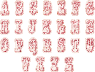
 I have a friend who just started with FotoFusion. Her first question was, how do you use the letters that come on one page in FF? We texted back and forth, me giving her the step by step, so I figured there might be others out there who would like to know how to do it too. So I've created a tutorial for you. Here goes! I have a set by Traci Reed from Sweet Shoppe Designs called Little Miss that needed to be separated. It looks like this:
Step 1: Open a New Project.
Step 2: Choose Custom size.
Step 3: You want a small canvas, about 500 pixels square. Go to your Canvas Settings tab, and input 500x500 pixels. By default, the measurements are in inches, but you want pixels. Click APPLY TO THIS PAGE.
Step 4: Right- click the area beside your workspace, and choose MAKE CANVAS TRANSPARENT. You want the letters on a transparent background.
Step 5: Go to the ORGANIZE tab, and find a set of letters you want to separate. I have a set by Traci Reed from Sweet Shoppe Designs called Little Miss. Drag the the letters into a bucket.
Step 6: Go back to the CREATE tab, and click on the BUCKETS tab, and drag the letters onto the transparent canvas.
Step 7: Remove the shadow from the letters. Hover your mouse over the FRAME dialog box, once the shadow is highlighted in red, click on it, and the shadow will be removed. Once you have separated all the letters, you will bring them back individually into the bucket, so you don't want shadows doubled. Hope that makes sense.
Step 8: Now, with the letters selected, right-click and select LOCK ASPECT RATIO and IMAGE FRAME. This will allow you to pan and zoom on the image, like you would with a picture.
Step 9: Maneuver the box of letters with the blue handles, until it fits nicely on the canvas, with a bit of space all around.
Step 10: Zoom in and pan the little yellow star in the middle of the box and the yellow boxes on the corners until you have only one letter (start with A), on the canvas. Make sure NOTHING else is on the canvas.
You might have to move the whole image sideways so it's centered on the workspace.
Step 11:
-Go to the OUPUT tab, and create a new file for this letter.
-I like to include the store, designer, kit, and then the letter name. So, for this one, I called it SSD TReed Little Miss-A (SSD stands for the website I purchased the alphabet from. TReed stands for Traci Reed, the designer of the product.)
-Browse your files and pick a spot to store the new letters. I made a new folder beforehand, under Digital Scrapbooking>Alphabets. The folder name includes the store, designer and kit name.
-You want to render it as a PNG, not JPG, so be sure to change that, and then make sure it will be rendered (flattened) at 300dpi, which is the standard quality for digital scrapbooking products.
-Click RENDER.
This is what it looks like once you've rendered it.
Repeat steps 6-11 with the letter B, and on and on.
Each time you are ready to render, all you'll need to change in the File Name box is the letter name, unless you have worked with other files in FotoFusion in between this project. :)
Happy Scrapbooking!


