I've been busy busy busy playing with Instagram instead of my templates! I'm so sorry if you were waiting for another one. But finally it's done. :) This newest template is actually a two-page version of the previous one. So, when you download it, you will get two SCRAP packages, instead of only the usual one.
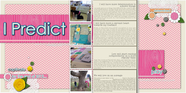
The layout I created:

The following are some of the steps I took in creating the layout from the templates.
Some of these tips might be too easy for the more advanced user, but perhaps some techniques might be new to you. :)
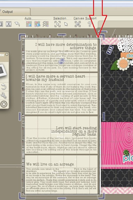
First, a picture of the right side template. Lots of space for journaling, and a nice big spot to place a photo or to showcase patterned paper.
First, a picture of the right side template. Lots of space for journaling, and a nice big spot to place a photo or to showcase patterned paper.
♦I removed the border on the frames. I felt the journaling would looked a bit trapped with them there.
♦To change the color of the space behind the text, I increased the opacity to 255, and then used the color picker to get the color I want.
To do that:
1. Select the frame (I had to move the text away from the frame, in order to select it.)
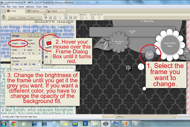
2. Hover your mouse over the Frame Dialog Box and click when the image (little square) part becomes red.
3. Move the slider on the Opacity level of the Background Fill until it is 255.
4. Click on the little box right below the 255. The color picker will appear as your cursor and make it hover over the color you want. I simply selected the cream right beside it.
5. Move the text back into place.
NOTE: When I work with a color scheme, I bring in a picture of it, and "color pick" from the picture/paper. For this project, I used the papers to color-match, and the background of the FotoFusion interface. LOL (Love the browns and creams, great neutrals.)
♦I change the sub-title: "We will live on an acreage", so that the right margin was lined up, instead of centered.
♦There are three little different-sized circles by that sub-title. I added flower embellishments on top of those circles, instead of dropping in paper. Got these cute little embellies from Sahlin Studio called Candy Flowers. So those circles in the template work well for proper placement of embellishments, if you find that you struggle to know where to place items.
♦I didn't want the shadowed flower embellishments to lie underneath the non-shadowed sub-title, so I selected the text>right-clicked and chose MOVE TO LAYER>selected COLLAGE. By default, FotoFusion is programmed the text to be always on top of everything else. This changes the text to the same layer as the rest of the stuff on your page.
♦Next, I changed the flowers to white, and dropped in patterned paper for the flower middles. I changed the opacity of the background fill to 255, but you could also experiment: what color change would occur by simply changing the brightness of the main image. See picture below.

♦I "grounded" the journaling spots to the background by adding a brown and a white paper behind them. I also removed the shadow from each journaling block and made the top and bottom spots larger so there was no gap between the top and bottom of the page. Does that make any sense?

And here's the finished page for the right side of the layout.
Now, on to the left side of the layout. Here's a pic of the template:
♦First thing, I dropped in the coordinating paper.
♦Edited the text.
♦Dropped in the pictures.
♦Added patterned paper to one flower circle and one little confetti circle.
♦Changed the color of the flower to white.
♦Substituted the leaves and some of the flowers from Sahlin Studio's Precocious Felt Leaves kit and from her Candy Flowers kit.
♦Added stitches by Anna Aspnes at O'Scraps. Made sure to remove the shadow, as it looks more realistic without.
♦Removed the shadow on the little strip of paper under the title. Used the color picker to coordinate the paper strips with the other papers.
In the end, I put the two together to see how they would look side by side, and decided it looked too dark. So I switched patterns and changed the background color.
I also made the top and bottom pictures go off the page, like I did with the journaling spots on the right side layout. I also widened the paper strip under the main title so that it reached the very edge.
This is the end result: It looks a little busy, but sometimes I'm okay with that. :) To see larger, just click on the picture.
Enjoy!


Excelents tutorials, congratulations
ReplyDelete