Showing posts with label Digi. Show all posts

Sunday, June 8, 2014

Free FotoFusion Template No. 25


I'm back with another free FotoFusion template for all you Lumapix FotoFusion users. (After at least a year break!) I have no idea if these work in the new version. I still have the old one, and I'm not willing to upgrade. It only has a few improvements, and I am really familiar with the old one. :) Let me know if my templates work in V5, any of you, okay? Thanks!

This template is fully customizable. It has room for five vertical photos, room for journaling on the middle left, and you can add a patterned background or change to a solid color.

If you don't like the flowers, you could always trade in gears or doilies or something like that, and the leaves for buttons. :) The flowers and leaves are fully customizable, so you can change the colors or even drop in patterned paper, including the middles. When you load the template in FotoFusion, you may not be able to see the flower middles, but they are there if you hover your mouse over the middle. :)

The title and journaling spots are also editable. You can move each letter close together, make them larger, change the colors, change the fonts, change the outline, etc.


I created a quick layout with the template. It only took about 15 minutes to make. The only thing I changed was the fonts for the subtitles. :) Kits used is by Creashens. It's a really old kit, so not sure if it is still available/


Would love to see the layouts you make with my templates! :)

♥♥♥  Anna   ♥♥♥

Monday, July 29, 2013

Free Facebook Cover Collage Tutorial and Template

Hi everyone!

This post has a free FotoFusion V4 Template you can download. :)

I've been very busy creating and learning new art techniques, but have not taken the time to share those things on my blog. Lately, I feel a bit overwhelmed with posting anything. Perfectionist me, I want it to be a quality post, and I feel inadequate, so it hasn't happened! :(

So, this morning, I decided that was enough.

I just updated the cover photo on my Facebook using my digital software, FotoFusion. People are asking how I do it, so figured I could make a little tutorial here. :)

My latest photo collage:


It's my simplest layout ever! :)

1. Download the template. (Only tested in Version 4 of FotoFusion.)
2. Open FotoFusion and load the template.
3. Simply drop in the photos you want included.
4. Output it as a JPEG at about 700dpi and 100% quality, as you don't want it to be pixelated.
5. Go to your Facebook profile, hover over the bottom left photo area, until "Change Cover Photo" pops up. Click on it.
6. Upload your layout, and VOILA! Done! :) It should be the right size. If not, email me or post a comment, k?

Note: Keep in mind that your profile picture at the lower left side of the layout will overlap onto your cover photo, so don't drop in a picture that you don't want covered in that area. :)

Here's your download link for the template:

AWCAL Facebook Cover Photo Template

Enjoy!

Annawhocropsalot

Monday, April 16, 2012

8.5x11 FF Template No.22


For those of you who work with 8.5x11 layouts, here is Template No.22 in that size.
Click below for a safe instant download.
 
Happy Day to you!

Saturday, April 14, 2012

Template No.22

Some of you like 11x8.5 sized layouts, so for layout No.22, I've created both. The 12x12, shown below has more elements and more papers, with the center the same as the 11x8.5.


Next, is the 11x8.5. As you can see, this is exactly like the one above, minus the outer area.


Below is the layout I made templates from.


I home educate, so my kids don't get the yearly school photo, so I have fun taking my own. I am happy with how Liam's photos turned out this year. Often I get the eyes in shadow so you can't see their color, but this time it was much better. :)

I love the paint splats.

But most specially, I LOVE the subject: dear Liam. Happy-Go-Lucky, content Liam. Liam who is just proud to be himself. No hurry to be someone he's not. No hurry to talk, no hurry to read, heck, no hurry to even memorize his ABCs. He's so very different from his older siblings. I love him to pieces. Oh, did I mention he loves cuddling? His favorite things are Cars, Nathaniel, Daddy, sleeping in late and chocolate. :) Oh, and he loves to cuddle. :)

Products Used:
Papers, and brads, washer, bracket, number, paint "mess": Michelle Martin Mischief Maker
White paint below picture: Michelle Martin Little Boy Blue
Fonts: Cheri, Bodini Poster and Century
Templates: my own: AWCAL Template No.22

 I actually started the layout by creating an 11x8.5 layout, saving it as a JPEG, and then dragging it onto a 12x12 canvas, and adding a few elements. Here is the layout using the11x8.5 template:


One neat trick/tool in FotoFusion I like to use is the Frame Splitter. See THIS TUTORIALhttps://artfulstories.blogspot.ca/p/splitting-tool.html to see how I do that. Works great to quickly add more spots for more photos, perfectly alligned. So, instead of using just one photo, I can use several, lickety "split". Here's that version:


For the 12x12 Template, click on the link below:

For the 11x8.5 Template, click on this one:


For both sizes, click on this last one:
Hope you enjoy these templates. Please let me know if you encounter any problems. I love to see your layouts! Leave a comment with a link to your page. Happy Spring! (Though, in my area, we got inches of snow today!)


Tuesday, March 20, 2012

FotoFusion Tutorial: Separating Alphabets

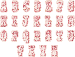
I have a friend who just started with FotoFusion. Her first question was, how do you use the letters that come on one page in FF? We texted back and forth, me giving her the step by step, so I figured there might be others out there who would like to know how to do it too. So I've created a tutorial for you. Here goes! I have a set by Traci Reed from Sweet Shoppe Designs called Little Miss that needed to be separated. It looks like this: 

Step 1: Open a New Project.


Step 2: Choose Custom size.


Step 3: You want a small canvas, about 500 pixels square. Go to your Canvas Settings tab, and input 500x500 pixels. By default, the measurements are in inches, but you want pixels. Click APPLY TO THIS PAGE.


Step 4: Right- click the area beside your workspace, and choose MAKE CANVAS TRANSPARENT. You want the letters on a transparent background.


Step 5: Go to the ORGANIZE tab, and find a set of letters you want to separate. I have a set by Traci Reed from Sweet Shoppe Designs called Little Miss. Drag the the letters into a bucket.


Step 6: Go back to the CREATE tab, and click on the BUCKETS tab, and drag the letters onto the transparent canvas.


Step 7: Remove the shadow from the letters. Hover your mouse over the FRAME dialog box, once the shadow is highlighted in red, click on it, and the shadow will be removed. Once you have separated all the letters, you will bring them back individually into the bucket, so you don't want shadows doubled. Hope that makes sense.


Step 8: Now, with the letters selected, right-click and select LOCK ASPECT RATIO and IMAGE FRAME. This will allow you to pan and zoom on the image, like you would with a picture. 


Step 9: Maneuver the box of letters with the blue handles, until it fits nicely on the canvas, with a bit of space all around.


Step 10: Zoom in and pan the little yellow star in the middle of the box and the yellow boxes on the corners until you have only one letter (start with A), on the canvas. Make sure NOTHING else is on the canvas.


You might have to move the whole image sideways so it's centered on the workspace.


Step 11:
-Go to the OUPUT tab, and create a new file for this letter.

-I like to include the store, designer, kit, and then the letter name. So, for this one, I called it SSD TReed Little Miss-A (SSD stands for the website I purchased the alphabet from. TReed stands for Traci Reed, the designer of the product.)

-Browse your files and pick a spot to store the new letters. I made a new folder beforehand, under Digital Scrapbooking>Alphabets. The folder name includes the store, designer and kit name.

-You want to render it as a PNG, not JPG, so be sure to change that, and then make sure it will be rendered (flattened) at 300dpi, which is the standard quality for digital scrapbooking products.

-Click RENDER.


This is what it looks like once you've rendered it.


Repeat steps 6-11 with the letter B, and on and on.


Each time you are ready to render, all you'll need to change in the File Name box is the letter name, unless you have worked with other files in FotoFusion in between this project. :)


Happy Scrapbooking!


Wednesday, January 4, 2012

FotoFusion Template #20


Finally! For those of you that use Lumapix FotoFusion, here's another .scrap template for you.

Room for twelve photos, some flowers, layers of paper, lines for extra texture or patterns, and of course, there's space for journaling. I put a frame on the paper that's behind the photos, but you could always uncheck the frame box if you don't want that. Or you could change the color of the frame, or shape, etc, etc. It looks neat if you drop in pretty paper into the flowers. The template itself has a shadow on all the middles of the flowers, simply because that way you can see there's a circle there that you can add to. I prefer no shadow on a flower middle if I'm using patterned paper, but each to his own. :)
Hope you like it! 
Please, if you have any questions about how to use the template, contact me. 
I'd love to hear how you use them and to see your layouts. 
THIS TEMPLATE ONLY WORKS IN FOTOFUSION. Sorry!


This is how it should look in FotoFusion:


A Happy New Year Everyone!


Wednesday, November 3, 2010

No Domestic Goddess

If my house was as organized as my digital scrapbooking files are, I'd be a domestic goddess. So, I'm not going to share my home organizational system (Yikes! You don't wanna know!), but I will share my digi system. Here it is: (For what it's worth.)


I created a Digital Scrapbooking file under My Documents. Then I created subfolders named: 
Alphas and Numbers
Brushes
Calendars
Color Swatches
Embellishments
Fonts
Frames
Inspiring Layouts
Journaling Labels
Kits
Layouts
Masks
Overlays
Papers
Quick Pages
Sketches
Stitches
Templates
Word Art
Zipped Files
and more...

- In each subfolder, I have more subfolders, named with the Store, Designer and Kit  Ex. OScraps KDSmet Her Personality. So this is the tier: My Documents>Digital Scrapbooking>Kits>OScraps KDSmet Her Personality.

- If I have one brad (for example) with nothing else with it, I store it under Embellishments>Misc, I also have a Misc file under Papers, Overlays, Stitches, etc.

- For kits with just paper, I store it under Papers.

- I make a copy of all my alphas that come in kits. One copy is stored in Alphas and Numbers and the other is stored with the kit.

- I use stitches on almost every page I create, so I've copied my favorite stitches that come in kits to the Stitches folder.

- Anything I've created myself, I store under my design name: Annawhocropsalot.

- I store all my zipped files temporarily under Zipped Files. When I have enough to fill a CD, a move them to the CD to get it off my computer for backup. I also store them online at www.mediafire.com. They offer a free service, but they erased all my files without warning me, so now I have a plan which has a monthly fee of $9 or so.

- Try to move the files where they need to go right after you download something. It's so easy to forget and then have an overwhelming mess.

For those of you that struggle with finding your digi stuff, I hope this helps you out.

Here's a screenshot of my main digital files: (Of course, what you can't see, are all my subfolders.)


I laid it out in more detail here.

Friday, October 15, 2010

New FotoFusion Template and Layout

Have you seen this amazing sale?!?! Kim DeSmet is retiring, so her entire store is on sale for twenty bucks! The following layout was created using one of her kits. It's called Her Personality. I love it. Click here to go there.


I've made another template and created a layout with it. I hope you like it.


Template No. 11


Tips on using the template No. 11:


1. I created little circles for the flower middles, but you could always add brads, buttons or bling. 


2. You might have difficulty moving the little circles. The mouse tends to click on the yellow "panning" circle. To cease your frustration----:P----click on the blank area around your canvas to reset your mouse. Then click and drag. (The panning tool won't be activated with that first selection.) Does that make any sense at all? If not, just disregard my tip here and figure it out yourself. LOL (And declare Anna plum crazy.) Oh, don't select and release, click and drag is the order of business here. :)


3. You can add patterned paper to the slide mount (the little rounded frame). Just select it, go to the paper in your bucket you want to use, right-click>APPLY TO SELECTED FRAME.

4. There are empty image frames behind the slide mounts. If you find your picture does not want to fit into the little rectangular window, try changing the shape of the image frame. That worked for me. :)

5. The best tip is #5: The "title" and "subtitle" text is on the COLLAGE layer, not on the default text layer. In plain English, that means you can move the title backwards and forwards in your layers. You vant to know how I didit it?:)
Here she goes: Select the title>right-click>MOVE TO LAYER>check the little box that says COLLAGE.
You're welcome.:) (You just don't know how excited I was when I discovered that little tidbit.)

6. FOR THE NEWBIES. If the above tip made absolutely no sense to you, you gotta know this! If you would like a flower petal, for instance, to be BEHIND your photo, but you dragged it onto your canvas after your photo (so it's above your photo),you can change it! Select the flower>right-click>choose SEND BACKWARD. Whoo hoo! Isn't that great?


ABOUT THE LAYOUT:

1. The patterned paper that kind of fades into the background on the left side of the canvas was created using the matte called BLACK HORIZONTAL GRADIENT. Drag the paper onto your canvas, resize it the desired size, open your BORDER DIALOG BOX. In here you will find that coooooool matte. Select it, and VOILA! I also reduced the opacity of the image so that it wasn't quite so bright on my page. You know, it was gettin' busy and all. You understand.:) Remove the shadow on the paper. Very important.


2. I always remove the shadow on my stitches to make them look sewn to the page.

3. I split the largest image frame into two to better compensate my photos. If you don't know how to use the splitting tool, check out my tutorial on that awesome tool.


There you have it. All that blatherin' has come to an end. I heard the sound of relief from all you. See ya'all a little later!
Products Used:
Papers, flowers, buttons, bling, etc: OScraps: Kim De Smet Her Personality 
Stitches: Designer Digitals: Anna Aspens Stitched by Anna White No.07
Mask on upper right area of layout: Designer Digitals: Anna Aspens FotoBlendz Clipping Masks No.6
 (I "copied" this mask into my FotoFusion Mattes Folder.)
Fonts: Arial Black, Burst My Bubble and Cheri
ANOTHER TEMPLATE NEXT FRIDAY. I hope to, anyway. I'm not very good with my promises sometimes. I gotta work on that.


If you have any questions or comments, please email me at customscrapbooksbyanna(at)gmail(dot)com.