Showing posts with label watercolor. Show all posts

Sunday, June 28, 2015

Daisies Afoot in my DLP Art Journal


June 20 art prompt is hometown inspiration,
and the journaling prompt is: There is no place like home.

I instantly thought of all the wandering and discovering I and the kids do around home. We have wild nature as our backyard. This year we have lots of daisies growing everywhere and I love taking photos of them! 


My youngest brought me some of the beauties, and they graced my table for a week. I finally got up the nerve to do a little 5 minute sketch. I was quite pleased how it turned out! So next, I got up the courage to color it in with watercolors! I painted it on Japanese Tomoe River paper, which is a strong but very thin, somewhat translucent paper. It has a very similar texture of good quality bible pages. The use of water on the page created an interesting warp, which I think lends itself to the imperfectionist style I am going for. :) Took some manipulating of the paint and water on the page to get it right. Well, I know there's lots of improvements I could make to this, but it's my very FIRST watercoloring piece from a sketch, so I'm happy! A for effort, right? ;)


See this pattern in the center of the daisy? It's a beautiful pattern that is found in many aspects of nature, like in the honeycomb, the pine cone, snail shells, and more. Based on these patterns, the Fabonicci sequence was discovered by classical mathemeticans. I'm not explaining it well at all. I suggest googling it for a clearer idea, if you're interested. They came up with an algorithm for use in many practical ways. It's fascinating to me! Math IS art! I talked about this to my daughter and niece, so that's where the art journal page comes in! I had posted this on my Instagram feed, and chose to copy my words to my page, documenting my "traveling".


I sewed messily around my watercolor painting, and glued it to my page. I added a square of bright yellow paint through a gorgeous stencil above it. Now it sat for a few days, too busy to work on it, or no ideas coming forth of what to do next to make it look cohesive.

A few days later, it all came together. 


A doily at the bottom, cut in half, on a yellow paint and ink background.


I used a fountain pen for the border, which has water-soluable ink in it. I also added Dylusions spray in a water brush, spritzing it several times, and wiping away, repeat, repeat, until I had the look I wanted for the background. The letters are foam stamps, an old set by Magnetic Poetry, from back in the day when I was an avid scrapbooker. It is still one of my very favorite alphabet stamp sets! :)


Before adding anything to the page, I gessoed it first. See the corner? It's thick with gesso and water and paint layers. Once dry, I scratched with an exacto knife, adding more texture to the piece. I spritzed water over Dylusions ink spots by the letters as well, to get a more watercolor-y effect. I also doodled with a white Signo Uniball gel pen over the letters, so that they weren't quite so stark and for added dimension.


And here it is again, the whole page. 

I had a great time doing this! I want to thank the Art 5 ladies for all that they do, inspiring us with great challenges, and it's all free. 

Thanks for stopping by!

Blessings, and ART ON! :)

♥♥ Anna ♥♥

Tuesday, September 30, 2014

Gelli-Printing -- Doodles -- Watercolours -- Stencils -- DLP Challenge

Hello, there! 

Alert: If you don't like pink, I recommend you scroll no further!  ;)

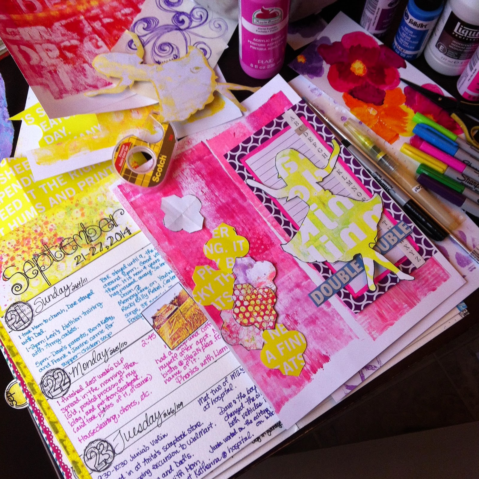
Going strong right now with my Documented Life journal. How about you? My mojo waxes and wanes, so I don't feel like showing the blah-pages, just the good ones. Believe me, not happy with lots of my weeks, but I will not re-do them! This project is a wonderful process in getting more practice with techniques and learning new ones! I'm really having a hard time with the Face challenge. That one sits, unfinished at this point!

My previous post (and week) was all about gorgeous Fall, with Fall colours, but for this week, I ran with my favorite colours: pink, turquoise, and yellow. I think I like Fall because of the brightness of the colours.


See those yellow shapes on the right side, to the left of the girl? They are shaped like Moroccan tiles. I saw a beautiful series of artwork by mixed media artist Jill Ricci that I wanted to emulate. Since I was unsuccessful in drawing the shape myself, I searched online and found a free printable pattern on a blog called Mel Stampz. (Really shouldn't be that hard. Not sure why I couldn't do it...) I downloaded the paper, printed it off, cut out one of the shapes, enlarged to the right size, cut out again, and used it as a template. (Although, my version of these morrocan tiles look NOTHING like the fantastic art of Jill Ricci!) See my Pinterest board for her art.


Photo above is my Week 39 spread, with tip-in closed.

I completed the Week 12 Challenge: Cut up a magazine and add it to your page. (Working completely out of order with this project!)

Back to the yellow Moroccan tile shapes: I was in the stationery section of a grocery store, looking for something, when I spied some fabulous bright yellow paper, with white text. Upon closer inspection, it was the covering for copy paper. Well, all of a sudden copy paper was on my to-buy list! Teehee! So, that's what that paper was converted to!

I added depth by using a watercolour pencil, Sharpie marker and waterbrushes loaded with yellow, pink, and brown ink. Learned that trick from the fabulous Roben-Marie Smith, one of the talented Art to the 5th girls. The challenge said to use a magazine, but I figured packaging counted too. ;)

The other morrocan tile shapes are Gelli-printed paper, which, by the way, I have an gi-normous pile of!

Seriously, my Gelli-print pile is at least a foot high! A great way of using up these fun prints is making party banners, which I have done quite a bit of. That project could be the fodder for a future blog post perhaps?

Added some fun junk mail snippings, old children's book pieces, a page from a note-pad that I altered with neon-pink paint marker, and words that represent my longing for my niece that hasn't been with us for some time now. I miss her so! I painted in those words behind the girl shape.

I created the girl by taking a photo of my artwork that I had made in remembrance of her a few years ago. She is dancing freely in heaven. She can dance like she wants to now. I have a very sweet set of photos of her dancing on our lawn with my daughter and her younger sister. So precious. She is happy happy now, dancing for her saviour Jesus!

Why I chose to include my niece in this week makes no sense, because it was this week four years ago, that we lost a nephew on my hubby's side of the family. One day I will document that.

The pink background is simply made from cleaning off the brayer during Gelli-printing. I added scratchy lines with my fine-line Sharpie marker.


Tip-in open. The week header and the background of the tip-in areGelli-prints, altered with watercolours, stencil shapes, white gel pen, and more. The beautiful flowers are painted by my daughter. Those shapes to the right and also behind the flowers are made using a stencil I made.


That white strip with the holes in them is from a white paper bag, punched with the Swiss Cheese EK SUccess Slim Edger Punch. Fun. I adhered it to the Gelli-print background with matte medium. I also tore strips of paper napkins to add more texture.


Header background is from a series of Gell-prints I made in that color scheme...

Doodley doos and watercolor touches inspired by oogling fabulous artist CD Muckosky's work and Danielle Donaldson's masterpieces. These two girls are so talented, fun, and have such a free-ing attitude about art.


For the day colour strips I used my Neocolor 2 crayons. Love how they blend so easily! 

-----My friend's baby is soooo cute!-----

And there, I'm done now. Since I work my journal in monthly signatures, I have one more page spread to go for the September signature, as it is the second last week of September. Can't quite believe it'll be October so soon! Where did my summer disappear too?!? 

Oh, and you know what? Our westerly neighbors chopped and mulched down almost every single tree on their property!!! What is up with that! Makes me very very sad. Love those trees, and the shelter from the wind! And less privacy now too...:(

Well, I'm off to read to my boys and hubby. That is, if they're willing to give up their fun and awfully noisy game of that traditional marble game they've been playing for the last 45 minutes. ;) Before that they were in the garage, trying to get hubby's old snowmobile going. You know, winter = snowmobiles. October's near, which could mean snow...

Goodnight!

Anna

Monday, September 22, 2014

I Love September! My Week 38 in DLP

Fall
all at once
summer collapsed
into fall

-- Oscar Wilde

I wish it could always be September. 

On that note, here is my fall-infused entry week 38 of The Documented Life Project. 

The colors, the smells, the way the sunlight plays on the changing colors, it is just utterly breathtaking to me! 


^^ Full spread with tip-in open pictured above. ^^


^^Tip-in closed.^^

The top of my tip-in is a collage of my late summer and early fall Instagram photos. The collage is simply done by going to www.Prinkl.com, connecting your Instagram account, adding photos to template, and saving as a PDF to my hard drive, then printing it out on my printer.

I cut off strips of my fall watercolour painting that is in the inside part of the tip-in to accommodate the smaller width of the tip-in, and added the strips to this page.

The yellow strip on the right is some lovely Scotch brand Washi tape that my twin gifted to me. Thank you, Sis! I love it!


^^ Tip-in open.^^

I painted the fall leaves many years ago, and the piece was sitting all this time in my art journal filing system (I do have some of my art journal fodder organized but most of it is all over the place. LOL) It now has a HOME! :)

This is week 38 of my art journal/artsy planner, but I did the week 39 challenge. See HERE for more information about DLP if you're not familiar with it yet. :) See HERE for this week's challenge: Splatters and Drips

I wrote the "Fall" part of the quote with a watercolour brush. Added water, and made it run by holding the paper upright. Simple, but a little dangerous, because I wasn't sure how it would turn out...#bebrave


Doodley-dos with my Sharpie fine-line...

An apology to my Canadian readers: I spelled "potato" with an E! Sorry about that! Up here in Canada we leave out the e, so this kinda bothers me! Teehee! Oh well, too late to change it now.


I scribbled around some of the photos to add a bit of interest and to help ground the collage. Black always manages to ground things visually.


The header above ^^ was created by first sketching/doodling the leaves messily, then messily added drops and splats, you know, like the challenge says to. :) I altered it a bit with a brush until I liked the look. I used acrylic inks for the splattering and Dylusions inks in a waterbrush to move the color around, and to add some other colors.

Friday, August 15, 2014

My handmade Journal for DLP


Some of you have been asking how I made my DLP journal. Here goes:

I used Canson 15x11" 140lb watercolor paper, with each sheet folded in half.

To prepare my journal for binding, I used this method: How to Make a Sketchbook: Coptic Stitch.

To bind all the pages, I plan on doing this: Coptic Stitch Binding Tutorial

The only reason I haven't bound it yet is because I haven't taken the time! In hindsight, this is better for working in, because even though the Coptic Stitch binding method gives me a lay-flat binding, I won't have to wrestle with trying to have a flat surface to work on. As the book gets thicker and thicker, the more I'd get frustrated with an uneven surface. To work on my pages, I just grab one month at a time. I do wish every now and then that my book was all intact, especially to carry it around and when people want to see it. :)

My daughter and I made a video where I page through my pages, showing each signature and some more little details. Nothing grand or professional looking about the video, but it'll give you an idea of my set up. :P At about 1:20, I show the folded pieces of watercolor pages.


My bubbles page:


Supplies:
Watercolor paper
Neocolor II water-soluble wax crayons
Black marker, fine-tipped (I used Sharpie)
White paint pen (I used Painters)

Directions:

1. With the wax crayons, randomly color different circles, pressing hard, and then softly coloring in the middles. Cover the whole page with multiple colors, not paying too much attention to placement, as long as you don't leave huge gaps in between circles.

2. Wet brush, dissolve the color in the circles, focusing on allowing water to pool to one side of each circle. Try to collect the color in the same spots of each circle. Let brush touch the dark outlined part of each circle to bring in lots of vivid color into the circle. Let dry THOROUGHLY.

3. Outline each circle with the black marker, attempting to not touch the actual circle. Doodle another circle around the first one, being careful to not overlap the other circles. So some circled outlines will be behind others, depending how close the circles are to each other. Do it randomly, in no particular order. I started at the bottom, and kind of moved to the top, to the edge, but really no particular order. Important that you keep it random.

4. Color in the little gaps with black.

5. Add dots to each circle with the white paint pen, ensuring you add the dots to the same side of each circle. I painted them all on the right side, but it doesn't matter which side you choose, as long as they are consistently on one side. See photo. Let dry.

And you're done! Easy peasy, just a little time consuming, right?

:)

Haha, looking at the close-up, I noticed I missed a few areas with the white paint pen. Perfectionism kills creativity, I will just say. ;P

Let me know if I missed any details, and I love questions!
Thanks for visiting! Happy day to you!

Anna

Saturday, July 12, 2014

Watercolored Squares Calendar

Hello blogland! 

Some of you have been asking me how I make my stencils for my month-at-a-glance pages in my Documented Life Project journal. For the tutorial, scroll down to the bottom of this post for the link.


A close-up of my January page, the first one I made. 


This is the June layout. Might add more details yet to this one.


Lots of doodles on my Match page. My favorite is the flower on the far right side. :)

My main inspiration for these doodles come from Tangle Patterns and Helen William's blog A Little Lime

For a tutorial on how to make your own stencils for this calendar, go to Emily Galore's website here.

 To download my pattern I used for the stencil, go to this older post of mine here. A note: you will want to adjust the size of the template so it fits your planner. I made it slightly too large for my 15x11 page spread. Let me know if you need help with that. Love to help you out! :)

Enjoy!

Anna

Sunday, June 29, 2014

Be the Color in Someone's Grey Day: Week 26 of DLP

The Documented Life Project
Week 26 


I used my handy dandy Sakura watercolor brush loaded with full strength Dylusions ink for this week's spread. I have the Zesty Lemon (see the yellow day strips?) and the Calypso Teal (the week header) in these great brushes, but will add six more once they get here from www.dickblick.com. Can't wait. Use them everywhere! I just love the Dylusions colors, so having them available as a brush is great. (I don't use sprays as much as brushes and pencils, as they're not as versatile.)

The right hand side is the tip-in, as shown in my previous post. See the LIFT tab there? I added that just now, so that when you page through my art journal, you can see there's something to see underneath this rose. :)

I chose to go all yellow with the day strips this time, instead of alternating different colors like I have in the previous weeks. I like how versatile my design is. I can vary it enough that I don't get bored. :)


This is how it looks with the tip-in open. Three pages. I chose to add a bit of teal and pink to my journaling so that everything matches.


Those pink doodles on the right hand side are so awfully crooked. LOL It's driving me a little bit bonkers, looking at it. I better just not look, huh? Not changing it now!


Be the color in someone's grey day. 

I'm off to supper with my family, so will have to finish post later. See ya!

Four and a half hours later...

Hi, I'm back. :)

I doodled these flowers on watercolor paper, watercolored them in, cut out and glued onto this previously gelli-printed music sheet. (It's the other side of the rose page.) Added more details with Sharpie, Twinkling H2O's. couple more yellows with varying kinds of watercolor pencils, added white details with Uniball Signo gel pen.
Doodled stems and circly things, and added more watercolor in different areas. It was really a project I kept on going back to, adding this and that. :)

I love how the music notes on the bottom right are peaking out from the background paint. :) I chose to go with a layout with lots of white space. White space gives your eyes room to rest, and also makes the flowers really be the center of the scene.


This week's header is filled with a tangle called using my Dylusions ink filled Sakura watercolor brush in Calypso Teal.

I don't the name of the tangle, but it's a cross between
FLUTTER TILE
FIFE
FLOURISH
NETTING
PUF
and
BALES
:)
I just used a simple label sticker for the title. Handy and quick. :)


Some of the pink paint bled through to the page on the left. Oh well. Adds character, right?


The title in hot pink was written with a Montana acrylic paint pen Gleaming Pink.

The background is a Gelli-print on vintage music paper. I think I was just cleaning off the plate, or from multiple printings. Only a bit of the paint was left over. I figure that makes for a nice subtle background. :)
Well, that's it Lovelies!
I'm looking forward to creating next week's pages. How about you?

Have a great evening.
Anna

Wednesday, June 25, 2014

Rose. Rose Red.

The Documented Life Project's Week 26 Challenge - Add a bible verse that inspires you - or a line from your favorite book.


I love my flower. It's all loose and free looking. Who says you have to stay within the lines? I wrote my words overtop the music notes, which I must say, looks too chaotic. You have to look close to actually be able to read the words. It's hard to write over gesso. I used a black Signo 270 pen.

This rose page is the top part of my tip-in (the flap) that I attached to the right edge of the two-page spread. I will share the other side and the whole week spread when the week is over. :)


 Is it okay to do a challenge twice? Well, I did. I shared my other one on Instagram. This just came pouring out of me! The drawing took maybe 5 minutes. The adding of colors and little details a little longer. 


1. I drew the flower first, quickly and without much thought, then added color to the flower and stem with watercolor pencils. 

2. Over top the drawing and watercolor pencil, I painted clear gesso to cover the vintage music paper, giving it more strength. (I used clear because I didn't want the drawing covered.)The gesso made the watercolors blend. I applied the gesso very messily, not really caring if color went outside the lines. 

3. I added more pink with gel watercolor crayons, three different pinks and a red with Montana acrylic pens, and Dylusions ink spray dipped with brush, 

4. In the lighter areas, I applied Pearl Ex mixed with acrylic glaze for some shine. 

5. With a finger, I blended white gesso around the rose so that it would stand out a bit more. 

6. Then I splattered Dylusions ink all over the page.


For the words, I chose a paragraph from an extremely profound book called The Mystery of Marriage by Mike Mason. I am taking forever to read the book, as every line is filled with so much meaning. It's not a skimmable book!


Happy creating!

Anna

Saturday, June 7, 2014

Week 23 of DLP Summary

Hi everyone! Thanks for stopping by. :)


The right side of this two page layout is the tip-in, as described on the Art to the 5th blog and DLP project. :) A tip-in is a flap you attach to the edge and opens to reveal more pages. 


Underneath will reveal the facing page of my weekly pages (the 4th of June to the 7th). I printed three of my Instagram photos using Prinkl.  I didn't get a photo showing the whole page. Below is some of it as well as the Week 23 challenge on the opposite side of this page. 


So, when you open the flap, this is what is underneath. :) I am really explaining it in a confusing way, but I guess that's how my brain works. Teehee! Basically, when you open the flap, you have a three-page spread. :) In photo above, the right side is the third page. Week 23 Challenge was to write down one thing you are grateful for each day. Fun and important challenge. 
Photo below is a close-up of the middle page.


My sister and I finally planted my garden yesterday. Made a little chart of what is where. Very very pleased that I have a garden! Also planted Hops yesterday. So excited about those. Hoping they will creep to the top of the garage. Our house faces the east wall of our very white garage. {fingers crossed} 

On the opposite side of the little flap you LIFT, is the ICAD 2014 prompts. If you want to see my first three ICADs, go here. Still need to do four of them. I like to do them in batches, though it is meant to decorate one index card per day...:)


A close-up of my Week 23, (First week of June) header. Some fun zentangling of exploding hearts and bright neon pink to make it all crazy looking. :) 

Well, week 23 is done, on to the next week! Next week's challenge is to use book text. That's an easy one, as I do that all the time.  

Happy documenting but do not forget to make meaningful memories with your loved ones.
♥♥♥ Anna ♥♥♥