Showing posts with label Layouts. Show all posts

Saturday, July 28, 2012

Two-Page Template

Hi all! How is your summer?

I've been busy busy busy playing with Instagram instead of my templates! I'm so sorry if you were waiting for another one. But finally it's done. :) This newest template is actually a two-page version of the previous one. So, when you download it, you will get two SCRAP packages, instead of only the usual one.


The layout I created:


The following are some of the steps I took in creating the layout from the templates.

Some of these tips might be too easy for the more advanced user, but perhaps some techniques might be new to you. :)

First, a picture of the right side template. Lots of space for journaling, and a nice big spot to place a photo or to showcase patterned paper.


♦I removed the border on the frames. I felt the journaling would looked a bit trapped with them there.
♦To change the color of the space behind the text, I increased the opacity to 255, and then used the color picker to get the color I want.

To do that:
      1. Select the frame (I had to move the text away from the frame, in order to select it.)
      2. Hover your mouse over the Frame Dialog Box and click when the image (little square) part becomes red.
      3. Move the slider on the Opacity level of the Background Fill until it is 255.
      4. Click on the little box right below the 255. The color picker will appear as your cursor and make it hover over the color you want. I simply selected the cream right beside it.    
      5.  Move the text back into place. 


NOTE: When I work with a color scheme, I bring in a picture of it, and "color pick" from the picture/paper. For this project, I used the papers to color-match, and the background of the FotoFusion interface. LOL (Love the browns and creams, great neutrals.)


♦I wanted some of my sub-titles by the journaling, so I added them where there was room. In the end, I decided to title all four of my journaling spots with my "predictions", and single words to sum up the pictures for the sub-titles in the other places. :)
♦I change the sub-title: "We will live on an acreage", so that the right margin was lined up, instead of centered.
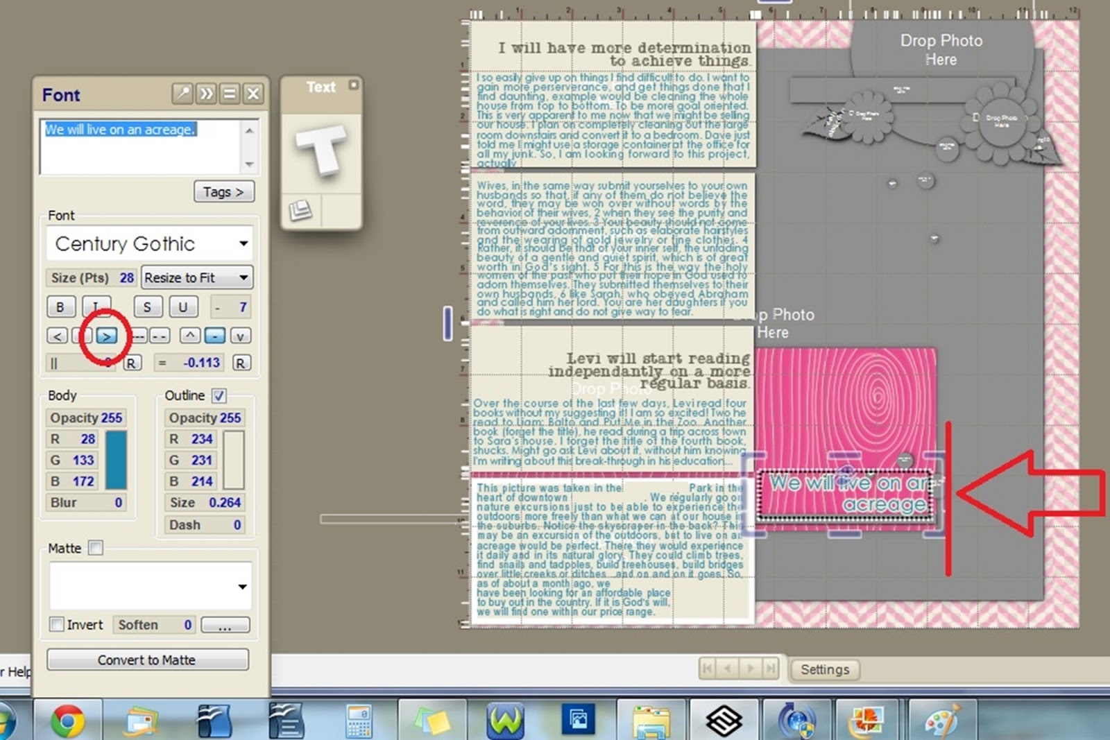
♦There are three little different-sized circles by that sub-title. I added flower embellishments on top of those circles, instead of dropping in paper. Got these cute little embellies from Sahlin Studio called Candy Flowers. So those circles in the template work well for proper placement of embellishments, if you find that you struggle to know where to place items.


♦I didn't want the shadowed flower embellishments to lie underneath the non-shadowed sub-title, so I selected the text>right-clicked and chose MOVE TO LAYER>selected COLLAGE. By default, FotoFusion is programmed the text to be always on top of everything else. This changes the text to the same layer as the rest of the stuff on your page.


♦Next, I changed the flowers to white, and dropped in patterned paper for the flower middles. I changed the opacity of the background fill to 255, but you could also experiment: what color change would occur by simply changing the brightness of the main image. See picture below.


♦I "grounded" the journaling spots to the background by adding a brown and a white paper behind them. I also removed the shadow from each journaling block and made the top and bottom spots larger so there was no gap between the top and bottom of the page. Does that make any sense?


And here's the finished page for the right side of the layout.


Now, on to the left side of the layout. Here's a pic of the template:


♦First thing, I dropped in the coordinating paper.
♦Edited the text.
♦Dropped in the pictures.
♦Added patterned paper to one flower circle and one little confetti circle.
♦Changed the color of the flower to white.
♦Substituted the leaves and some of the flowers from Sahlin Studio's Precocious Felt Leaves kit and from her Candy Flowers kit.
♦Added stitches by Anna Aspnes at O'Scraps. Made sure to remove the shadow, as it looks more realistic without.
♦Removed the shadow on the little strip of paper under the title. Used the color picker to coordinate the paper strips with the other papers.

In the end, I put the two together to see how they would look side by side, and decided it looked too dark. So I switched patterns and changed the background color.

I also made the top and bottom pictures go off the page, like I did with the journaling spots on the right side layout. I also widened the paper strip under the main title so that it reached the very edge.

This is the end result: It looks a little busy, but sometimes I'm okay with that. :) To see larger, just click on the picture.


Enjoy!


Sunday, May 20, 2012

FotoFusion Template No.23


Back in 2008, Amanda Probst wrote a monthly column in the Creating Keepsakes Magazine called Album in a Year. Every month she suggested a topic for you to scrapbook, capturing and documenting specific things every month. So, for January, she had you come up with predictions for January of the following year, and snapping photos or find some in your stash that would suit that topic. I was instantly hooked on the idea of creating one layout a month. For a (almost) complete list of her monthly topics, go here.

My daughter and I are working on this project for 2012. I figured this would be a great way for her to practice writing. I am a little late with this of course, like I often am, so my predictions weren't made until May. LOL

I chose to predict four things, and found a picture that would suit each one:

Prediction #1. determined: I will have more determination to achieve things.  Okay, now writing this for my blog, it sounds a little vague and wordy. Sorry. :) Maybe more specifically, focus on my goals more? The photo is of me cleaning, cleaning, cleaning. I get bogged down easily when the task is unpleasant or hard or when I'm not sure how to do it... Maybe just a nice way of saying I'm lazy? :) I am not picky when it comes to cleanliness, so it's hard to be motivated.

Prediction #2. captivate: I will have a more servant heart toward my husband. Like I mentioned earlier, cleaning, doing something for my husband that he really appreciates. I can be selfish, thinking of only my wants and needs, I want to love and respect my husband. Jesus my Saviour was King of Kings, but instead of wearing his royal robes, he chose a towel to show his love! I want inward beauty. See John 13:4 and 1 Peter 3:4 The photo is of a layout I made after being inspired by a lovely lady to be more captivating. I sewed and painted like crazy on this layout. I really like it.

Prediction #3 read: Levi will start reading independently on a more regular basis. He knows how to read, but it's still difficult for him. I aim to be more consistent in coaching him in this. Find books that are more up his ally, perhaps Captain Underpants stories, Sigmund Brouwer books, etc. You know, boy books. The picture I chose is a close-up of a sight-word game I play with him. I actually made those cards myself. Teehee

Prediction #4 play: We will live on an acreage. We are working toward that goal right now. There are many reasons we want to live in the country, one being I want my kids to be able to climb trees with abandon, not being yelled at for breaking off branches! The photo is taken at a local park, in the city. Thought that was fitting. :)

So, here is the preview of the template I created for this project, based on the sketches by Amanda. I made versions of the layout in 11x8.5 and 8.5x11 as well.

This is the 8.5x11 version:


I like the 11x8.5 version better than the 8.5x11, I think. :)


Notice the small leaves? They are one of the mattes that FotoFusion has. I really like it! Love that you can color them whatever you want to. :) So, when you download the template, they will be included in the package automatically, but you won't need to keep the matte, since you will already have it.

Note: These templates only work in FotoFusion, as they are .SCRAP files.

I had a great time making these templates, even though I did spend countless hours on them. LOL I am a crazy perfectionist when it comes to certain things. If you find a problem with these templates, please let me know, so I can fix it. Enjoy!

Here are the download links.


Products Used:
Papers: Michelle Underwood Feb Two Peas Soup
Candy Flowers by Sahlin Studio
Houndstooth button and leaf by Sahlin Studio: Precocious
Stitches: Stitched by Anna No.07 by Anna Aspens
White splatter paint and white doily by AWCAL Designs 
Journaling fonts: John HancockCP, Century Gothic, Cheri Liney, Mel's Type A Personality
The title font is AWCAL Designs 

♥Enjoy your day! ♥


Saturday, April 14, 2012

Template No.22

Some of you like 11x8.5 sized layouts, so for layout No.22, I've created both. The 12x12, shown below has more elements and more papers, with the center the same as the 11x8.5.


Next, is the 11x8.5. As you can see, this is exactly like the one above, minus the outer area.


Below is the layout I made templates from.


I home educate, so my kids don't get the yearly school photo, so I have fun taking my own. I am happy with how Liam's photos turned out this year. Often I get the eyes in shadow so you can't see their color, but this time it was much better. :)

I love the paint splats.

But most specially, I LOVE the subject: dear Liam. Happy-Go-Lucky, content Liam. Liam who is just proud to be himself. No hurry to be someone he's not. No hurry to talk, no hurry to read, heck, no hurry to even memorize his ABCs. He's so very different from his older siblings. I love him to pieces. Oh, did I mention he loves cuddling? His favorite things are Cars, Nathaniel, Daddy, sleeping in late and chocolate. :) Oh, and he loves to cuddle. :)

Products Used:
Papers, and brads, washer, bracket, number, paint "mess": Michelle Martin Mischief Maker
White paint below picture: Michelle Martin Little Boy Blue
Fonts: Cheri, Bodini Poster and Century
Templates: my own: AWCAL Template No.22

 I actually started the layout by creating an 11x8.5 layout, saving it as a JPEG, and then dragging it onto a 12x12 canvas, and adding a few elements. Here is the layout using the11x8.5 template:


One neat trick/tool in FotoFusion I like to use is the Frame Splitter. See THIS TUTORIALhttps://artfulstories.blogspot.ca/p/splitting-tool.html to see how I do that. Works great to quickly add more spots for more photos, perfectly alligned. So, instead of using just one photo, I can use several, lickety "split". Here's that version:


For the 12x12 Template, click on the link below:

For the 11x8.5 Template, click on this one:


For both sizes, click on this last one:
Hope you enjoy these templates. Please let me know if you encounter any problems. I love to see your layouts! Leave a comment with a link to your page. Happy Spring! (Though, in my area, we got inches of snow today!)


Saturday, March 3, 2012

Template 21


I made a layout of the latest template. With this template, it's important for you to copy the snowflake mattes that come with the file to your mattes folder on your hard drive, the place where the FotoFusion files are stored. If you don't know how to do that, please let me know, and I can help you.

Products Used:
Papers: KPertiet: From My Bookshelf - Solids
Alphabet: CD Muckosky: Suzie Q
Stitches: Traci Reed: Bad Sewing Machine-Write It Down, Brittish Designs: Tie It Down
Flowers,leaf, paint splat, number rub-ons: Vinnie Pearce Placid
Font: Century
Snowflakes: my own mattes made using a snowflake font.

Here's a preview of the template. Note: this is a Scrap. template which is made for use in Lumapix FotoFusion. 
For the background, you could put in a solid paper or a pattern. I used a patterned, and added two others from the same line. 
Occasionally I like to keep the border around the paper.

Three of the snowflakes are somewhat see-through, so if you would prefer them at regular opacity, just change that in the image dialog box. You could also drop in papers, since they are mattes, not embellishments.

I added some additional elements to the background: the numbers in the bottom right corner and some snowflakes, but reduced to a low opacity, so that they're not as bright. I just wanted to add a little bit of detail, not something that would stand out too much. Now these snowflakes are the same ones as I put near the large photo, but with shadow removed and "moved" to the back (Right-click>Send To Back).

Instead of using the title font, I brought in alphas by CD Muckosky. I love these letters!

For the stitches, I made sure they didn't go off the paper, only to the edge of the top paper. In order to "cut" short the stitch, right-click>Scrap Image Frame. Then adjust the blue handles until you have the stitch at the size you want. Sometimes this method doesn't work for some reason. LOL  If I don't do that, but want to shorten the stitch, it would make the whole stitch smaller.

Do you scrapbook a summary of each month? I always plan on it, but I somehow get lost in all my other projects. :)

Here's the download link to the template:


Happy Scrapbooking!


Monday, May 2, 2011

Pretty To Do List


I'm wide awake.
So I scrapbook. 
Real life here!

Reason #1 for not sleeping:

Osama Bin Laden news.

Reason #2

I'm still internalizing Steve Bell's amazing concert held tonight at my church. (Technically, it was yesterday.) Have you ever heard of this guy? If you enjoy poetry and storytelling, you will enjoy him. You gotta see!

Reason #3

I'm soaring. Jesus is in my soul!

Products Used 
Brushes: OScraps LydiaK Edgy Elegance
Fonts: David, Esat Hoxka, Harrison, Landliebe, Nymphs Handwriting, MS PMincho and Impact

I think I can sleep now.
Goodnight!


Saturday, January 29, 2011

Scrapbooking and Canned Soup


I'm scrapbooking with my sister-in-law. Canned soup for lunch, toys everywhere, bread crumbs on the living room floor, kids watching Thomas the Tank Engine, etc, etc...we're all having a grand time. If you want food, you have to help yourself.


This LOVE canvas is on my sister's wall. Of course, I made it with my software of choice: FotoFusion.

Tuesday, December 28, 2010

Homemade Giving

Click on the layout to turn the pages:

There's nothing quite like watching someone open a gift when it's something you've made yourself. This digital scrapbook that I had printed by Adoramapix was a complete surprise to the recipient. I "stole" the pictures from Sara one day when she wasn't looking. (Every so often, I organize her photos on her computer, so I grabbed a moment when she wasn't by the computer to copy them to my camera's memory card.) Tee hee. I love doing that! (not sure why the image is blurry...sorry!)

The cover of the album was actually my FIRST PUBLICATION in the Canadian Scrapbooker Magazine!!

Products used:
Vinnie Pearce Placid, Night Bird and Posied kits and Alpha Pebbles
Karla Dudley Digi Essentials
FruitLoop Sally Frosted Grunge brushes
Katie Pertiet various items
and more...


To see a review of AdoramaPix that matched my experience, go here: www.designsbymeganturnidge.com

Happy New Year to All!


Wednesday, November 24, 2010

Beautiful Amara

Creating this layout for a friend of mine was amazing! She is such a cutie!


Products Used:
Creashens - XO and Smitten
Vinnie Pearce -  My Drama Queen
Michelle Martin - Mischief Maker
Michelle Underwood - You Picked Me
Brittt-ish Designs - Tie It Down
Shabby Princess -Sprout
Katie Pertiet - Edge Die Cuts 4
CD Muckoskey Suzie Q Alpha
Burst My Bubble Font


Friday, October 29, 2010

I'm Smitten

Well, it's Friday again, so here is Template #13. I really enjoyed creating this one for some reason. I guess I'm happy with the result. I hope it'll be useful to y'all.


My take on the template is done with my favorite photos of my daughter, Junia, on her tenth birthday. I haven't really scrapbooked them until now.
                 
 Products Used:
Template: Annawhocropsalot (me): 12x12 FF Template No.13

Papers: Vinnie Pearce: My Bag Queen, Paislee Press and Sugarplum Paperie Colab: Patisserie, Cat Scrap: Something Blue ALT365 January
Brushes: Basic Grey:Color Me Silly, Designer Digitals: AASPN Korner Plumes No.02, House of 3: Rhonna Farrer Bird Cages
The paper that's behind the slide mount and the flat pink flower brush: OScraps: Nina Inspirational
Scallop Embellishment: OScraps Kim DeSmet: Happy Days
The middle of the scallop: Paislee Press and Sugarplum Colab: Patisserie
Metal wordart: OScrap: Kim DeSmet Freckles and Giggles
Diamond bling: OScrap: Kim DeSmet Cherish
Pink Daisy Flower: Vinnie Pearce Full Bloom Freebie
Pink Rose: Cat Scrap: Creashens: XO
Letters: Cat Scrap: Creashens: Smitten
Stitches: Designer Digitals AASPN Stitched Circles White and Stitched By Anna Bubblegum No.01, Scrap Matters: Britt-ish Designs Tie It Down
Fonts: Landliebe and Burst My Bubble