Showing posts with label dylusionsink. Show all posts

Sunday, December 28, 2014

Christmas in my DLP Journal

Another week in my Documented Life Project journal.

If you are new here, and have not heard of this project, check out the Art to the 5th Academy! I've been following along all year long, and now we're nearing the end! A weekly prompt keeps things challenging and fun! Here is the website: Art to the 5th

Had lots of fun with these pages.


I added a tip-in this week. (A tip-in is another page added in to your art journal.) The cross shown, is the inside part of the tip-in.

 For my calender pages, I did my usual sketch, then added in Neocolor 2 crayons for color.

The header has loads of layering because I just could not get it to look right. Final result has lots of modeling paste, gesso, Dylusions ink sprays, Viva Inka Gold color, and more. I used Staz-on ink for the stamping of the wise-men. The Bethlehem star is colored with the Viva Inka Gold in Rose Quartz color, making it really shiny.


\


The tip-in ended up in the shape of a cross. I used a stencil by Tim Holtz called Latticework, laying it down directly on the watercolor paper, and scraping modeling paste over the stencil. I got some awesome effects with it, as the stencil was "dirty" from previous projects.Once the paste was dry, I sprayed heavily with Dylusions sprays to get the loads of color. Final touches are Viva Inka Gold creamy metallic stuff for the cross outline and a few other areas. 


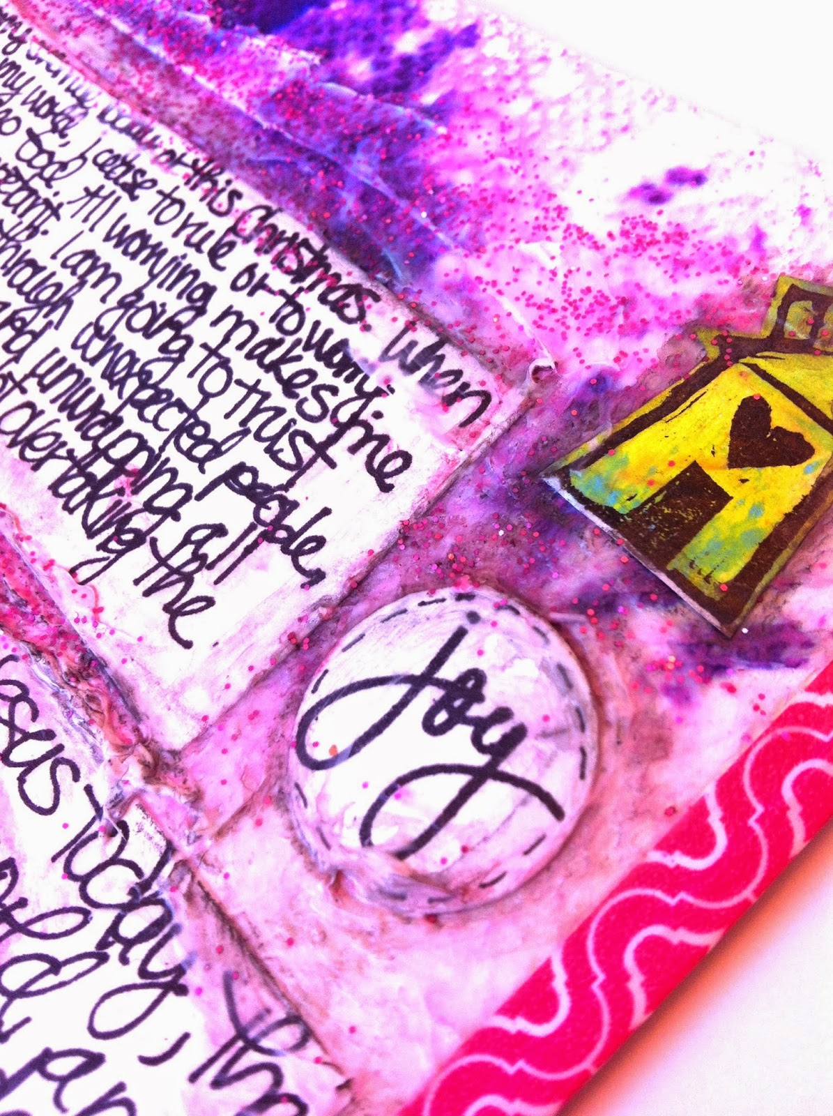
Tip-in closed. Daisy Yellow has an amazing project on her Instagram that I loved very much. Lots of layers of color, so that's what I tried with this page. I messily wrote Christmas devotions by Ann Voskamp on index cards, then put them down on the sprayed background. I then added modeling paste and glitter around the edges for texture. For increased depth, I took several watercolor pencils and scribbled around the edges as well, and wet it down, to engage the colors and add depth to the edges.


Lately I have been using a water brush filled with water to work the Neocolor2 crayons and other watercolors.


I used several pieces of happy mail by the lovely Lois, a fellow moderator on the DLP Facebook group. Finally, I incorporated some of the lovely artsy stuff I have received in the mail! If you don't know what happy mail is, check out my Pinterest board called Snail Mail Revolution! :) 


My background is layered with paper towels for texture as well. I sprayed it with Dylusions ink and water for more color.


Thanks for stopping by! I appreciate each and every one of you. :)


Sunday, June 29, 2014

Be the Color in Someone's Grey Day: Week 26 of DLP

The Documented Life Project
Week 26 


I used my handy dandy Sakura watercolor brush loaded with full strength Dylusions ink for this week's spread. I have the Zesty Lemon (see the yellow day strips?) and the Calypso Teal (the week header) in these great brushes, but will add six more once they get here from www.dickblick.com. Can't wait. Use them everywhere! I just love the Dylusions colors, so having them available as a brush is great. (I don't use sprays as much as brushes and pencils, as they're not as versatile.)

The right hand side is the tip-in, as shown in my previous post. See the LIFT tab there? I added that just now, so that when you page through my art journal, you can see there's something to see underneath this rose. :)

I chose to go all yellow with the day strips this time, instead of alternating different colors like I have in the previous weeks. I like how versatile my design is. I can vary it enough that I don't get bored. :)


This is how it looks with the tip-in open. Three pages. I chose to add a bit of teal and pink to my journaling so that everything matches.


Those pink doodles on the right hand side are so awfully crooked. LOL It's driving me a little bit bonkers, looking at it. I better just not look, huh? Not changing it now!


Be the color in someone's grey day. 

I'm off to supper with my family, so will have to finish post later. See ya!

Four and a half hours later...

Hi, I'm back. :)

I doodled these flowers on watercolor paper, watercolored them in, cut out and glued onto this previously gelli-printed music sheet. (It's the other side of the rose page.) Added more details with Sharpie, Twinkling H2O's. couple more yellows with varying kinds of watercolor pencils, added white details with Uniball Signo gel pen.
Doodled stems and circly things, and added more watercolor in different areas. It was really a project I kept on going back to, adding this and that. :)

I love how the music notes on the bottom right are peaking out from the background paint. :) I chose to go with a layout with lots of white space. White space gives your eyes room to rest, and also makes the flowers really be the center of the scene.


This week's header is filled with a tangle called using my Dylusions ink filled Sakura watercolor brush in Calypso Teal.

I don't the name of the tangle, but it's a cross between
FLUTTER TILE
FIFE
FLOURISH
NETTING
PUF
and
BALES
:)
I just used a simple label sticker for the title. Handy and quick. :)


Some of the pink paint bled through to the page on the left. Oh well. Adds character, right?


The title in hot pink was written with a Montana acrylic paint pen Gleaming Pink.

The background is a Gelli-print on vintage music paper. I think I was just cleaning off the plate, or from multiple printings. Only a bit of the paint was left over. I figure that makes for a nice subtle background. :)
Well, that's it Lovelies!
I'm looking forward to creating next week's pages. How about you?

Have a great evening.
Anna

Wednesday, June 18, 2014

Week 24: The Documented Life Project


June 8-14th, 2014 is one of my favorite weeks of this year. My kids were involved in our city's 100th year celebration, namely, in a community play. Very exciting.

And I want to boast about my spread: I love how this all turned out. The details, the colors, the content. 

I made a tip-in, shown on the right side in photo above. It was hard to get a good photo with proper lighting and accurate coloring today for some reason! This week's challenge was to fill your flap with hearts, so did that. A tower of hearts, let's say.


The flap opens to reveal the last half of the week .


Photo above is the back side of the flap: a scrapbook page! Felt so good working with photos again. :) I met a lady on Instagram who just could not stick to one type of scrapbooky art format, so she combined them all: art journals, traditional scrapbook pages, smashbooks and pocket scrapbooks. So, that's what I've got a bit going on here. :)

For placement of photos and elements, I used an idea sketch by PageMaps that matched the photo sizes and number of photos. If you are a scrapbooker and really struggle with where to place photos and embellish, I strongly recommend trying a map. There are hundreds to choose from. There are other companies that use maps too. Check it out! It totally revolutionized the design of my scrapbook layouts!


Will talk about the details of my pages, and will start with my week at a glance layout.

For this week's header, I filled in the background with Tim Holtz distress inks, using a baby wipe for blending. Then added doodling with a Sharpie and a few colors of Montana acrylic paint markers. Then, something I haven't done in a while, scrapbook paper! I was working on this page at my friend's scrapbook store when I spied this paper that just went absolutely perfect with my color scheme. Cute patterns of clouds and trees. :)

For the day strips of watercolor, I just used a few colors from a cheap brand of a watercolor pan set.

Now, just to warn you, the next set of photos you might find reduntant, but I could not just settle on which ones to include. I just love my flowers and doodles and colors here...


For the flowers, I used a punch set by Martha Stewart. One punch was the larger hydrangea flower, and the second punch was a set of three smaller ones. Decorated with my Montana acrylic pens, waterbrush filled with Dylusions ink and sharpie markers.


punched flowers out of old book paper (which was the DLP's challenge last week)...


neons mixed with retro pastel colors...


random dots make it so playful...


the second page: 
more flowers
some I punched out of Gelli-prints
others out of old book pages


some font play going on


The 13th was a rainy day, so added a cute little cloud with raindrops.


The little orange bird washi tape was a cheap set of three I found at Walmart. Thought it went well with the feel of this layout. This washi tape fastens the tip-in on the inside, so when you open and close it, everything will stay snug and intact. It bends well, but so decorative at the same time. Washi-tape, that is. :)

Now, for the scrapbook layout on the inside flap:


As seen in the photo of my photo grid, I could have placed another square photo beside the top middle, but I chose to go with a decorated square paper since I didn't have another photo to place there. Could have left it blank totally, but that didn't look quite right when I looked at my layout from a distance.


I used a simple index card for some of the embellishing, adding some journaling and doodles, cut out a piece from some patterned paper, punched more flowers out of Gelli-prints and old book paper, added doodles and dots, and last but not least, some watercoloring.

The background is an old Gelli-print I had laying around. Glued the whole thing to the flap with matte medium. 


Another little square of index card, doodles and flowers tucked in among the square photos which I printed off at www.prinkl.com


And now for the top of the flap: last week's challenge was to include text paper and this week's is to cover your flap with hearts. I did both here.


I think I bent one of the punches, trying to punch out some flowers of a triple layer of paper in the top left part of the page. LOL I was somewhat successful with the flowers, I like how you can see through to the other pages. :) 


I pinned this quote some time ago to my Words board on Pinterest, and since I am reading Mother Teresa's story right now to the kids in my homeschool, I figured it was timely and appropriate! The frame is from the same patterned paper set I got from the scrapbook store. It's Prima brand, but can't remember the name of the line. 


The bright yellow swirls were made using a cute set of Target watercolor gel crayons. You color with them, then wet them, creating a vivid design. LOVE! They are in the kids' section at Target! Only $4.50, or something like that!

Hot neon, two blues, white, and an orange Montana acrylic paint marker for the doodles.

 Stampin' Up punch of three different sized hearts. Use this punch A LOT! Very versatile! Again, I punched book paper, and doodled the edges. 

Really love the washi tape edges of this project! Art to the 5th ladies, you are brilliant! :)


The background is another Gelli-print I found that matched my colors so perfectly. You should see my stack of prints! Kinda embarrassing actually. LOL!

Well, finally the end of a very long post! Had such a great time creating these pages. Worked on it really early in the morning, some in the afternoon, some in the evening, and long into the night sometimes...work of love, it is!

Like Ms. Teresa said, 
Spread love wherever you go. Let no one ever come to you without leaving happier. 

Anna

P.S. Do check out her biography. You won't be disappointed, as she's a very inspiring lady. This is the book I'm reading to my family:


Wednesday, May 28, 2014

Spirograph and Silhouettes


 ♥  The Documented Life Project  ♥

May 11-17, 2014


Mixed colors for each day of the week...
Black zentangling for the header...
Some flippy flaps this time...
Turquoise watercoloring for the circle dates...
Dylusions Ink used as paint for the days of the week strips...


Silhouette flap with sewing complements of my daughter. I stole it from her art stash. She said later it was okay...teehee...
Dotted black and white washi-tape for the flap. I really do need to come up with a different method of creating a flap, really I do...


Another flappy thing...
An index card sized watercolor paper...
One specific thing that spells God's love to me lately...it's the little things I am so grateful for. I like to document them...
Circle watercolor spots, dotted and doodled with my go-to black Sharpie marker and a new white Signo Uni-ball UM 153 pen. Got 12 of them in the mail recently from Amazon for under 15 bucks!...

May 18-24, 2014 


More Dylusions Ink used as paint for the weekly strips...
Spirograph art using my old school set I still have from my childhood...
More turquoise colored circle dates...


Went with black Sharpie marker for the journaling this time...

Well, just a quick update on my ongoing Documented Life Project. I am going strong right now! I would like to change it up a bit more, but we'll see, we'll see. :)

Happy Day to you!
Anna ♥♥♥

Tuesday, March 4, 2014

Doodles, Watercolors and a Butterfly


My first pic is a little blurry, sorry. Daylight hours are gone, or I would retake this picture. This one will have to do.  Had lots of room to play with the first week of March, as the first landed on a Saturday. (Why did I set it up like this?! Grrrr... )


I just love cabbage roses. My take is somewhat juvenile, but this is a work in progress. After all, it's an ART JOURNAL. Come with me on a little rabbit trail here...

The definition of an ART JOURNAL:

1. It's an artist's journal.
2. It's an illustrated diary.
3. Debbie Hodge says, "Simply put, an art journal is a journal in which you combine art and words to express yourself".
4. It's a playground.
5. It's a place where you can put down your thoughts and questions.
6. It's a place where you can experiment with new techniques and new mediums. 
7. A place where you can learn something new.

So, even if I can't make roses like I'd like to, I can sure practice. That is part of the purpose of my art journal. :) No demand for perfection allowed!

Oh, and the "March" title is driving me crazy, because it's crookedly cut and crookedly mounted on the page. 


There was a crooked man, and he walked a crooked mile.
He found a crooked sixpence upon a crooked stile.
He bought a crooked cat, which caught a crooked mouse,
And they all lived together in a little crooked house.

Oh, sorry! Got distracted...

I added some doodles and stuff to see if I could make it look like it was on purpose. I think I was half successful. Tee hee! Oh, and the letter H I managed to not draw as tall as the other letters, had to improvise. so another imperfection. ;)

About the butterfly. I love it. It's a Tattered Angels stencil that I've had for ages. I simply placed it down on the page, masked off the other areas where I didn't want color, and proceeded to spray with three different colors of Dylusions Ink. They kinda blended together, and I really really like it. I might add colorful ombre sequins to the body of the butterfly yet. We'll see.

Next, I dropped droplets of water onto the color in random areas, creating this pooled watercolor look, which makes the colors brighter. 

I really like the washi tape there on the left edge...Each page of this art journal has a washi tape edge, in the spirit of The Documented Life Project.


This page spread is really FULL. I like to doodle while I listen to sermons at church. In this case, we did church at home this last Sunday. Made some notes while listening to a QandA session with Tim Keller. Those notes probably don't make a lot of sense to anyone but those that actually listened to it, but that's okay. It's my journal, my diary. :) Later, I added more doodles to fill out the page. The white paper is the top side of a flap.

I added many flaps to this side of the spread, as you will see in the next few photos. One of the challenges in the DLP was to make a flap on a flap. Not sure which number of challenge that was, but here it is. I am not following the challenges chronologically with this project, I'm all over the map. But that's okay. That's how I roll. My main goal is to document my every day, not necessarily the artsy part. It's a side benefit. Whoo hoo!

See the bright pink dots paper, with the words "about me"? That is another flap, but accordion-folded.


I created those circles using my Copic markers. Did that a long time ago, when I first had the markers. Saved the page in one of my sketch books, and finally gave it a real home in this art journal. Some of my own handwriting paired with some Basic Grey letter stickers, and we're good to go. Week 10 of the DLP was to creat a list of what makes me, ME. It was funny. I had just completed this list on a Friday, and the next day I read the challenge, and it fit exactly. It's not really a list of EXACTLY what makes me, ME, but it's a li'l list of little details about me. Figured that was close enough. :)

Saturday, the first of March was a crazy day of hubby helping me clean. Not my favoritist memory, 'cause he was a tad disgusted at my lack of deep cleaning...I can laugh about it now, but I was really mad at him for about a day. #maritalbliss But now, I have no dust on my fridge, no dust on my microwave, etc, etc. Was it worth it really? Not sure. Tee hee!

The map revealed under the first flap is one I tore out of a vintage atlas. Yummy. Love me some maps.


Let me tell you all about The Book Thief. If you loooove books, you gotta read this one and watch the movie. It's so sweet! (And sad.) I watched the movie first, then went out and bought the book. Not sure which to do first. Maybe...watch the movie first. The book is written in a really unique format, but it might be quite confusing if you hadn't watched the movie. It leaps from place to place. It reads just like the way I think: in a spaghetti-like fashion. LOL!

ANYWAYS...the quote above is one of the many juicy ways the author used to explain physical settings. Very very cool. Never thought of clouds "making room for each other" before! It's a literary genius! Couldn't stop thinking of this description. Hubby wasn't very interested, my twin wasn't really either, but the pages of my gesso-ed up art journal sure were all ears! Like I said earlier, an art journal can be so many things. I love writing down quotes. It's a perfect place for them.


I joined a postcard swap, and this is a lovely, lovely one I got blessed with.  My very first art postcard swap. Definitely want to do more of them! I think the squares are from a Gelli-print. It's darling! Thank you Melissa Schroeder! I attached it to another flap. So, flap on a flap - I did it! *The challenge, that is.)


I am learning so much about drawing since I started Zentangling! Love me some doodles.


 I got a little carried away with my ten things, and ended up with eleven. What can I say. So, every flap I make, I use washi tape. Simple simple. Nothing fancy. Simple.

Well, that's enough of my jabbing at you. 

adieu

goodbye

auf wiedersehen

au revoir