Showing posts with label arttothe5th. Show all posts

Thursday, November 24, 2016

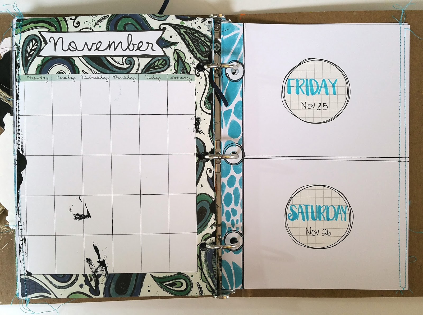
November in my unPlanner Part 01

Hello all

I have had some fun in my unPlanner again with a new colour palette: blues, greys, whites, blacks. We have full-fledged winter temps and snows up here in Canada, and I feel that suits my journal. :)

To discover other unPlanner ideas and see the project challenges and themes, sign up for The Documented Life Project 2016- The unPlanner at the Art to the 5th Academy or see the blog HERE.

The first part I've done is make the divider, and below is a photo of it open. 


This was my project for my StencilGirl Creative Team post over at the StencilGirl blog. To see my step-out tutorial, check it out HERE.


I enjoy the depth of this piece, using blue-black and varying shade of grey. 

If I had to sum up one thing I've learned from art journaling this year, it would be this: create depth with varying shades of colour!


Photo below, page on left, is a page from the unPlanner kit. The photo after this one, you see the other side of that page completely covered with black paint. I will do the same here. Page on right is my prepared pages for the rest of the month, where I journal daily.

A process pic of decorating the pre-made pocket page. Of course, StencilGirl stencils were used. ;) The "ladder" at the top part is a club stencil by MaryBeth. See it HERE. The "snowman" is from a stencil with three varied sized ovals. See the stencil HERE. The other stencils used are THIS and THIS 6x6 stencil.


I circled the part below to show you which part of the large stencil I used. :) More photos to come in my next blog post when I have the pocket pages complete. That's my plan, anyway.

Photo below is one of the items in that pocket. I painted a tag white, then glued photos to it. 


I discovered a fun app called Prisma, and spent too many hours playing with it! It transforms photos into different styles of art with filters. My favourite filter is the Wave and Candy. I discovered it from Miranda, through her weekly project called the 18/52 Art Journal Project

Scroll to bottom of post to see two more photos of my unPlanner.
The second photo on the tag is of my son and his silver velour cape.

Here are some more photos I tweaked. :) I might include a few of these in my unPlanner as well.

Before, of our tree in our front yard:


After, using the Wave filter:


Candy filter


Before:


After, with the Wave filter again.


Before, our shortcut through the trees to the mailboxes.


After


Before, some of the roses in my garden:


Before, photo of the brayered backgrounds I used for my August unPlanner pages:


After:


This last one is giving me ideas of painting backgrounds! Need to try!

Spent a good half hour driving around in the country yesterday, taking photos of the beautiful scenery around us. 


This altered version reminds me of some famous painter...but I can't remember who!


Well, it was fun to share what is happening in my unPlanner! I'm looking forward to making the PACs and the fun List10 this month. Hope I inspired you to work in your unPlanner or other artjournals!

♥♥♥  Anna  ♥♥♥


Wednesday, April 6, 2016

April unPlanner Pages Part 01

Hi everyone! I'm back again with another unPlanner post. Can you tell I'm seriously in love with this project? Thanks so much to Rae Missigman, Lorraine Bell and Sandi Keene! Check out the details HERE. ♥♥♥

I started a new binder, as the first one is completely full!

I choose happy, summery colors of summery for April. I might be rushing summer a bit here, but it's what I need to do. I'm sure all you northerners understand, correct? ;)

April divider is a card I had made some time ago, using gelliprints, and I call it a paper quilt.
I added a white cardstock half circle, wrote out the month with my Zig Clean Color Waterbrush markers.Stitching in black all around, of course. ;)
This is the front of the watercolour calendar tip-in.


Calendar all ready to fill in with fun doodles. I'm loving it so much!!


For the reinforcement spine: if you have followed my blog the last two years, you might have seen my watercolour bubbles tutorial. I used my April colors, and instead of using watercolor pencils, I just used those Zig markers. I simply painted circles, and outlined them with a fine-line Sharpie marker in black. I stitched in black again, of course.


Week 14 PAC done. Again, revisiting my 2014 DLP design. The words scribbled onto the watercolour paper are the lyrics to a song very dear to me: Speak Life by Toby Mac. See that design HERE. I added two designs of orange ribbon to add interest, and I cut out one of the yellow bubbles in my design for the reinforcement hole. I love it! 


For April 1 and 2, I have these lovely circles on a white cardstock, which I printed the weekly view download on, the download that comes with the project. To see how I made these pages, I created a fun tutorial. It's right HERE

Yellow bubbles for the reinforcement spine. :)


To house the PACs, I again altered the pocket pages to fit. Black stitching...

Close-up are always good, right? Here they are. :)


Pocket for the second PAC is ready to go. 


April 3- 10 ready to be filled in. I can't quite believe how caught up I am!


And we're done for now!

Thanks for visiting!!

♥♥♥  Anna  ♥♥♥

Monday, May 11, 2015

May 9 DLP Challenge: Stitches

This week's DLP challenge is one of my favorites so far: stitching. Well, close behind the Gelli®-printing one, actually. :)

Haven't heard of these DLP challenges? The project is called The Documented Life Project. Every week you get a journal prompt and an art prompt, with monthly themes. It's great for the beginner and the more advanced art journaler. Tons of support on the Academy and on the FB group! It's a wonderful community and place to be! Totally FREE to join!
It's the brainchild of four beautiful artists. Check out their blogs here:

 Sandi Keene,
Lorraine Bell
Roben-Marie Smith
Rae Missigman

Each week they share their take on the challenges.
Check out The Documented Life Project 2015 - The Journal here.

Anyway, back to my page.

I have been busy making little happy mail pockets with my sewing machine, so when I read the May 9th challenge: stitching, I was thrilled!

It all started with this gorgeous Gelli®-print I could not bring myself to use, as I liked all the little details on it so much. I didn't want to cover any of it. Then I started getting ideas on how to use it.

The print was mostly made by removing the paints from the brayer while Gelli®-printing. In addition, I learned how lovely the effect of brayering on top of the stencil on the Gelli® plate. So, lots of that on the background as well. I also added some stamping by covering the plate with paint, then stamping  on to the plate, then the background. Rae Missigman's stamps are so gorgeous, and I was so pleased with how the flowers looked against the other colors and patterns.


For the left side of the page, I attached flowers, and on the right -  an Audrey Hepburn quote.

Audrey Hepburn is brilliant, isn't she?

For BEAUTIFUL eyes, look for the GOOD in others.
For BEAUTIFUL lips, speak only words of KINDNESS
and for POISE, walk with the knowledge that you're never alone. 


For the flower: I freehanded the outline of each flower with my trusty black Stabilo All pencil, wet it,  and once it's almost dry, I added more freehand petals with the Bic white-out pen. I say "almost" because I didn't have the patience to wait until completely dry. LOL Then, I added some more color to the petals with Neocolors2 crayons and Gelatos. Next, I stitched around the circle, up the petals and back and forth in the flower middle. For the little dots, neon pink irRESISTable Pico Embellisher. These work so quickly and easily! I want every color! Scroll further down for a link to the product; if you want to know what I'm talking about. :) 

To make those pink circles with the white dots, I simply took a Stabilo All pencil and brought the existing circles forward from the background, adding white with a Bic white-out marker. (Next time I should take a photo of the Gelli®-print before I made changes, like a before and after.) 

The white harlequin texture is modeling paste, smoothed through a stencil. YUMMY! 


For those cute pink stitched circles, I sewed a grid on a piece of pink painted paper, and cut out circles, attaching to the page in a pleasing formation. ;) The purple flower has pink dots, right? They are made with a most darlingest of new art supply in my every-growing supply stash! They're called irRESISTable Pico embellishers.  This product creates sweet 3D texture.


Another close-up of the stitched circles and the modeling paste. Yum.


For the lettering, I used an old Ki Memories alpha stamp set, using a foam brush to apply the white acrylic paint to the letters. The smaller lettering is simply freehanding with a Bic white-out marker. It's my favorite new white "paint pen".

And there you have it. My Stitches challenge. :)


Thursday, April 2, 2015

DLP Week 11 Borders


Hi, everyone! 

March Theme:
 Making Your Mark (Doodles and Mark Making) 
March 14 Art Challenge:  Borders 

I have been struggling with the Documented Life Project challenges lately, and this week was no exception. I couldn't understand why mark-making was difficult for me, as I love doodling! Then it came to me: do what you know how to do. My goal with mark-making month was to try something new with the way I doodle. But now I know something: if I'm having difficulty, don't try to change your techniques, or try a different way of doing doodles, do what you know. So I started what I easily do: create flourishes. Then I got the idea of using my black Stabilo All for it, and so I did. That morphed into watercoloring them in, and so I did. And now I have done something with doodles I've never done before! So, I achieved my goal but I started with what I always do!


I created a border around the page. Then I was stuck again. LOL What to put in the middle...


After staring at the blank middle for days, I decided to just DO SOMETHING, so I picked up a paintbrush and started painting with acrylic in various blues, greens and yellows.


I had a Gelli-printing craze for a few days, with my kids looking on. My daughter got the bug too, and she came up with some fabulous prints. The chevron on the retro green-blue is one of them. She placed my home-made chevron masks on the plate, placed the paper down, let it sit there for a bit, then peeled off the paper. It looks like peeling paint on a wall, doesn't it? :) I added some circles from some of the prints I made. Also, the little scallop on the right edge is a handmade stamp I made a few weeks ago. Took my black Stabilo All again, and outlined the chevron lines with it, making them pop more. Still more tweeking to come...


See the peeled paint look? I love!

I trimmed the print to fit into the middle and glued it down. I added the circles, the stamped scallop, and the writing on the chevron.

Next I penciled in all the edges with the Stabilo All and wet it with a paintbrush. This created more definition in each piece and the overall look.


I also added the black around the little circles within the larger circles, and I also doodled in more with a Sharpie.


Blue markings with a Montana acrylic paint pen with black Sharpie details around them...


More circles in different colors of Montana paint pens and Sharpie...


For the little journaling on the chevron lines, I wrote about the creativity and chaos of my life, in reflection of this week's Journal Prompt: "Borderline feels like I'm going to lose my mind."

And we're done!
Thanks for stopping by!

Anna :)